Have you ever wondered – why you see certain colour as common in websites! The fast food restaurants’ uses orange and red as if it is compulsory! Why the most common colour for a software company site is blue! Have you ever wondered or noticed why certain films look a certain way!
Colour associated with a scene or frame or a character has a dramatic impact on how audience subconsciously relate to the characters. It can create elicit psychological reactions with the audience, or can draw focus to significant details or to show changes in the story.
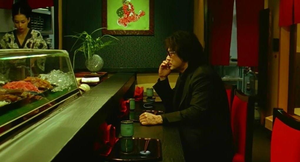
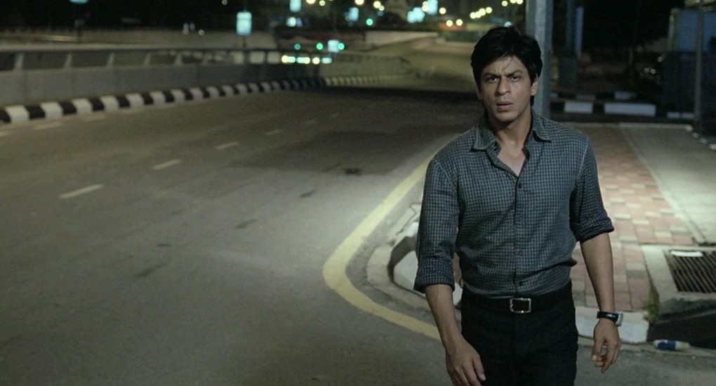
There are colour palettes which are used by great makers’ in order to work on audience emotion. The sci-fi and action genre favorite Monochromatic colour schemes are different shades of a single colour, for Eg. Blue, dark blue, and light blue. Check Matrix, Don (2006), Gone Girl and Se7en. Complementary colours are those opposite to each other on the colour wheel. Eg. Red and green. This can be seen in Mysshkin and Night Shyamalan movies, especially Anjathey and in the most influential French modern classic, Amelie. Night Shyamalan uses a contradict colour to grab the focus of the audience, or to show significance of particular object or person. The red coloured doors handle in The Sixth Sense. Complementary colours are often used to show conflict, internal or external.
Steven Spielberg’s gift to world cinema, Schindler’s List, the black and white film gets disrupted with a red dressed little girl, which represents the purity and joy at the same time it smashes with the death and evil. It is one of the greatest characteristic symbols you can come across in movies. Remember the red coat and the little girl in Nicolas Roeg’s Don’t Look Now.
Colour and Emotion
A well-placed ‘colour’ evokes mood, like a single, recurring colour brings a deeper meaning and can become a character itself. Wong Kar-wai’s most highly popular film ‘In the Mood for Love’ owes a huge part of its visual to colour red. We see Kate Winslet’s character in different hair colours throughout the film, Eternal Sunshine of a Spotless Mind which directly helps audiences to easily keep track of time frame.
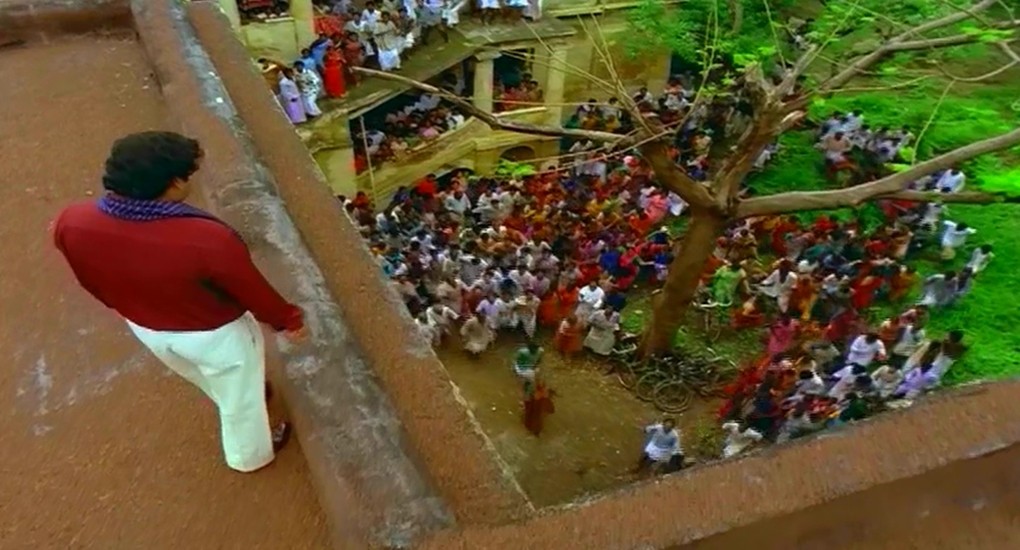
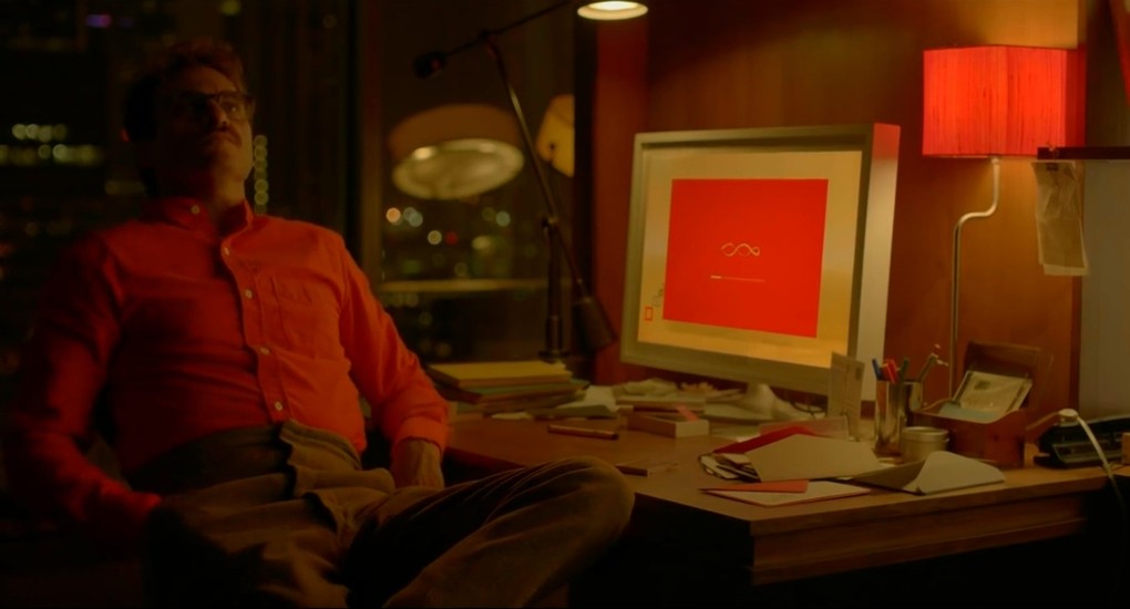
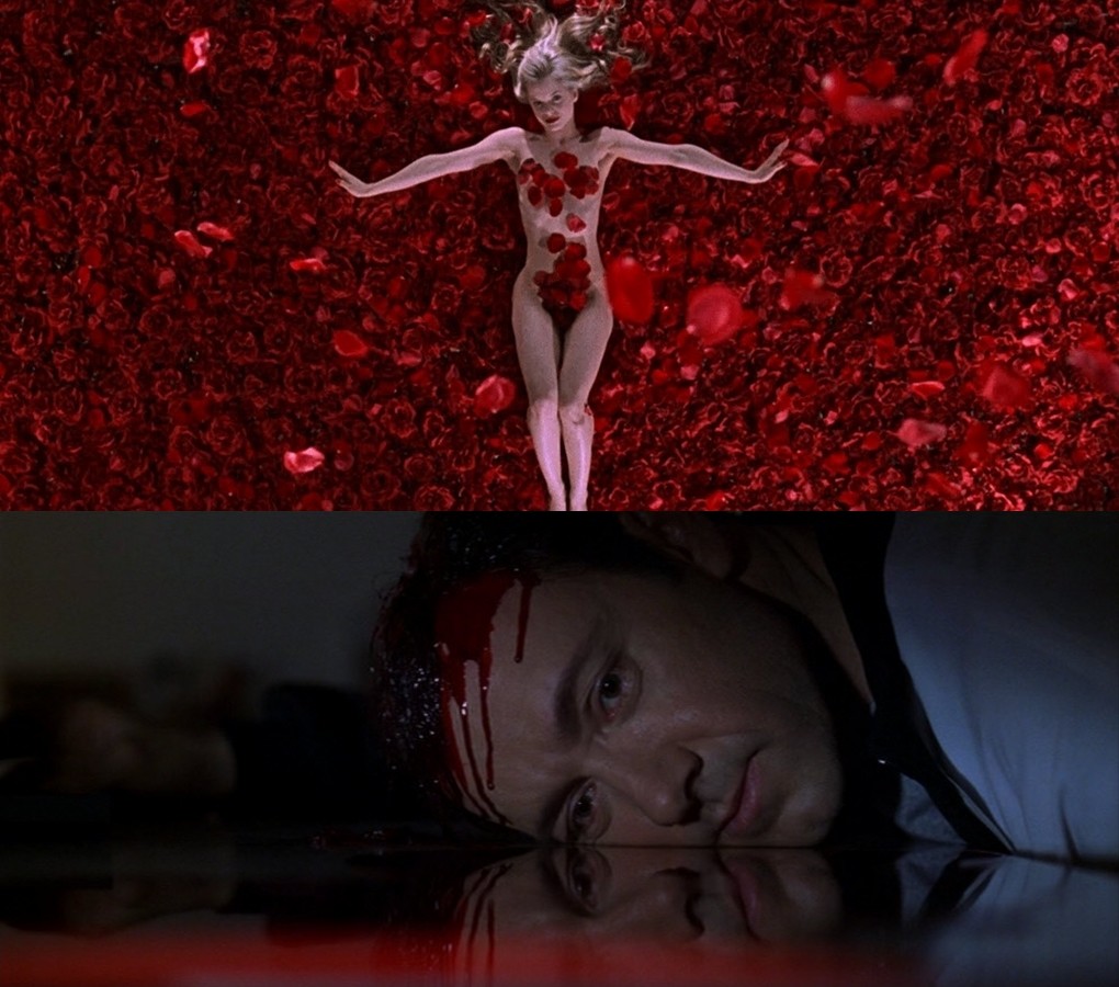
Black is power, elegance, style, mystery. It has more power than any other colour. Fear, anonymity, depth, evil, anger. It is called as the strongest of all colours. White is purity, and simplicity. It shows cleanliness, peace, and birth. It is the colour of winter, snow, and good. The most beautiful part of white is that it pairs well with just about anything. Red is love, passion and lust, Red is also intense, beautiful and mysterious. Red is stimulating and lively, at the same time demanding and aggressive.
A well used ‘colour’ can change the meaning of a scene.
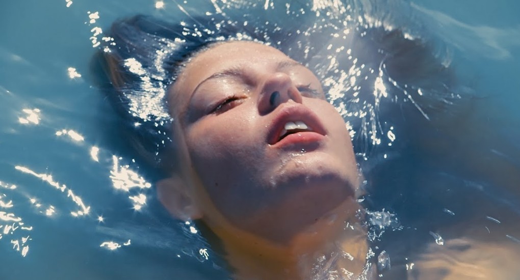
Green gives an emotional feel of soothing, healthy, renewal, spring, stable, and prosperous. Right colours at the right moment have the power far more than other aspects of filmmaking. One of the most common colours in Hollywood, Blue represents faith, loyalty, calm, stability, harmony, trust, confidence, cleanliness. It is the colour of sky, water, and cold. It is also the colour of technology. It is of the most popular in web design also. According to many surveys, blue is the world’s favourite colour. Pink is love, Pink is innocence. Pink is feminine. It has romantic, charming, and innocent feel in it.
Yellow resembles relaxation, joy, happiness, and imagination. It is an interesting colour: it is often associated with childishness but you would have noticed the colour in Kill Bill, a movie with a pond of blood, ‘yellow’ was used to show the character’s insanity and instability. Usage of Orange in the frame brings or shows enthusiasm, vibrant, and playful. Purple represents erotic, royalty, spirituality, enlightenment, power, and Luxurious. Brown gives a feel of materialistic, sensation, earthy, reliability, and comfort. The colour Gray represents riches, sleek, elegant, high-tech. A virtual absence of colour – black and white, gray exudes neutrality, or a lack of any particular sensation. Golden colour is mostly used to show something precious, something riche, or extravagant, something warm, wealthy, and grandeur.
Colours you see in movies are not made just by colour grading in post production. They are controlled on the set itself, it’s the art, it’s the production design. A well used ‘colour’ can change the meaning of a scene.

Cinephile. Learning the art of filmmaking. Writer. Filmmaker.



Be the first to comment on "Introduction to the Science of Color in Filmmaking – Color Theory"